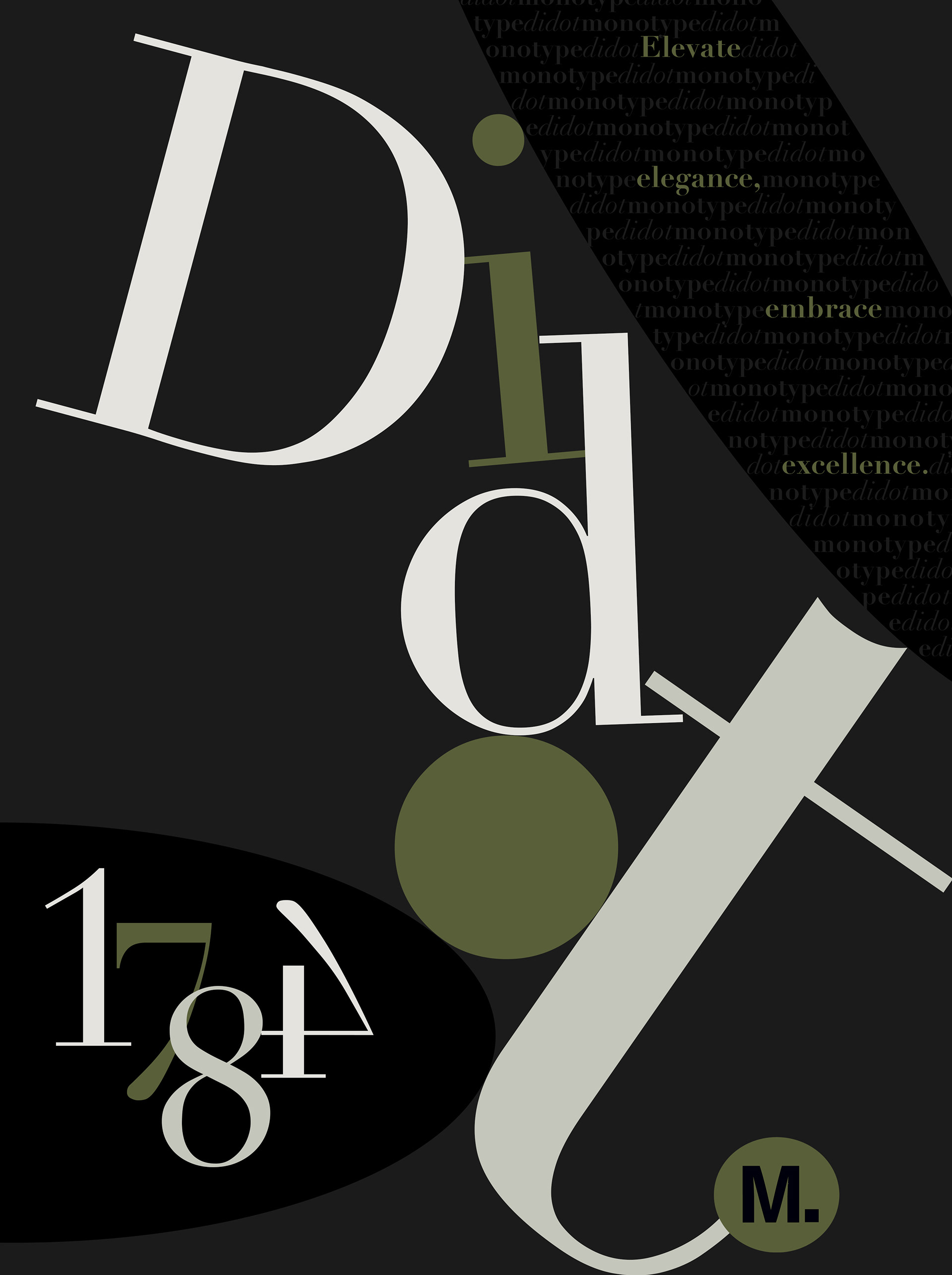
This monotype advertisement uses contrasting colors and large type to carry the eye from the name of the font down to the logo of the company in seconds.
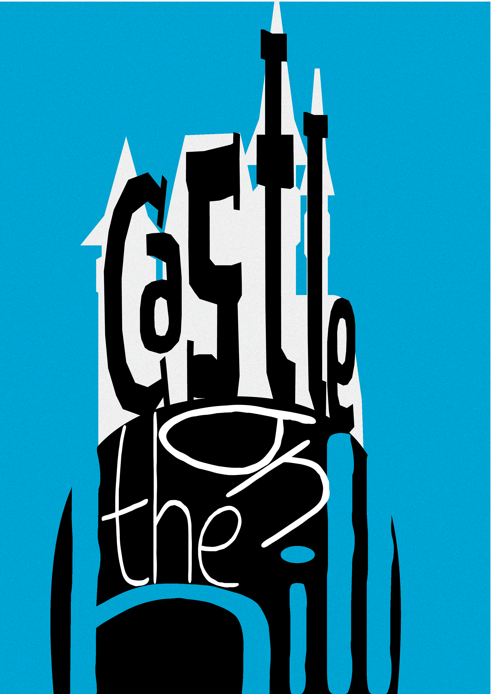
This exercise executed type as container, which brings to life the well known song "Caste on the Hill" as consumers read the title.
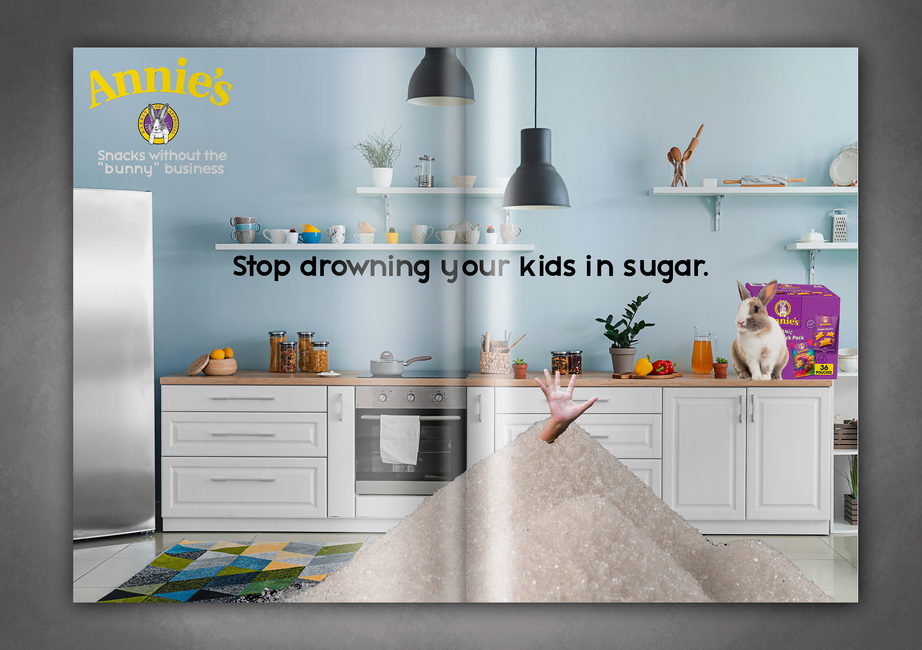
The Annie's brand is well known as a yummy, clean alternative to the typical children's snacks. This metaphor takes the realities of sugary snacks to a new level as a child is "drowned" in the piles of sugar he's consumed throughout the day.
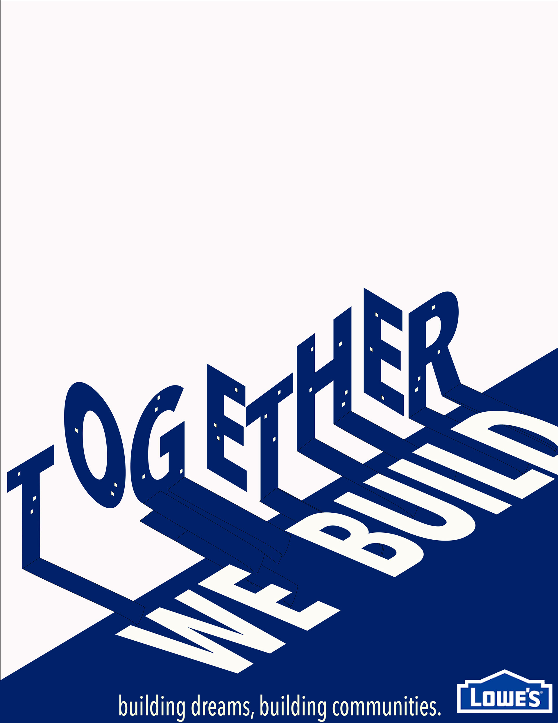
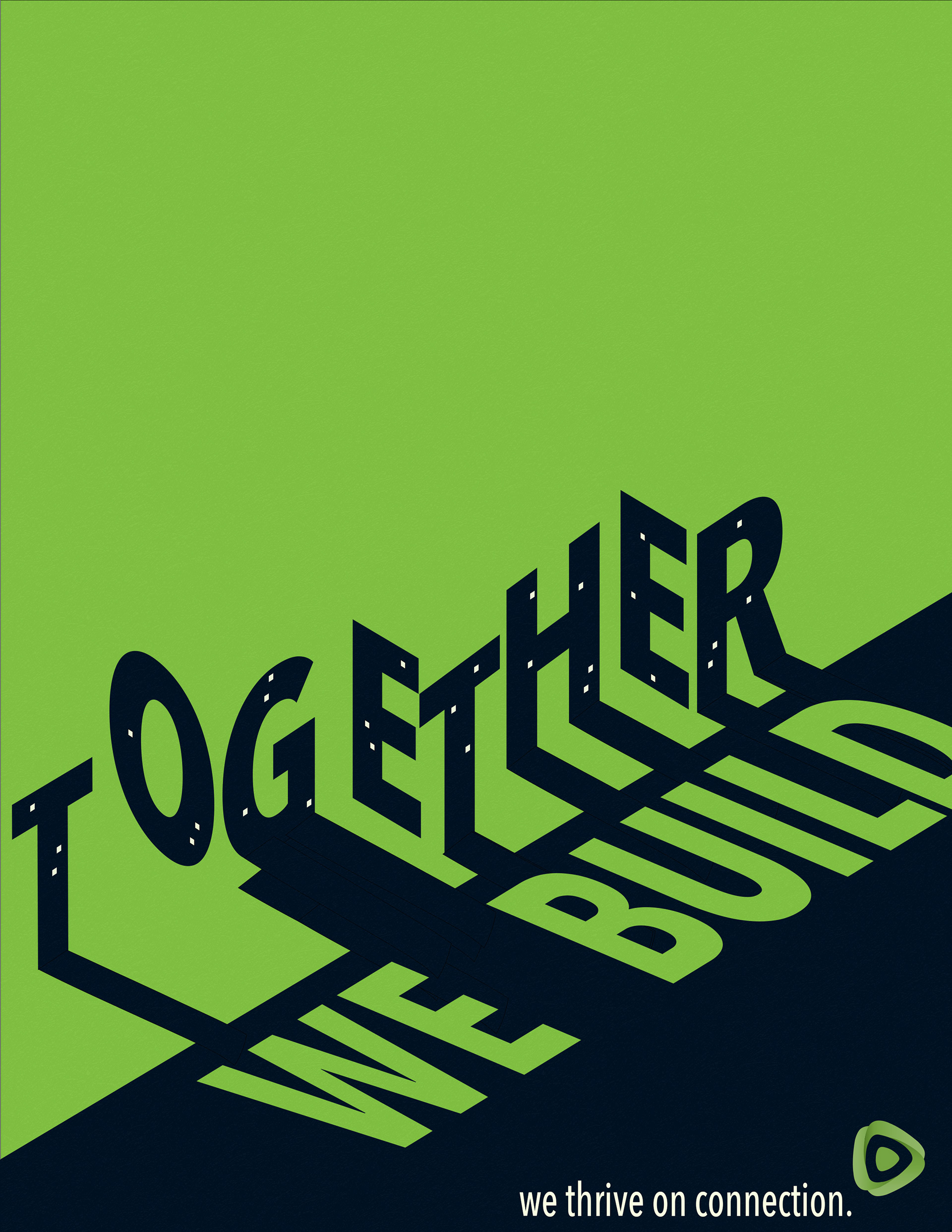
Using text as shape, a cityscape is build from each individual letter, reinforcing the headline's implication that each individual comes together to build something greater.
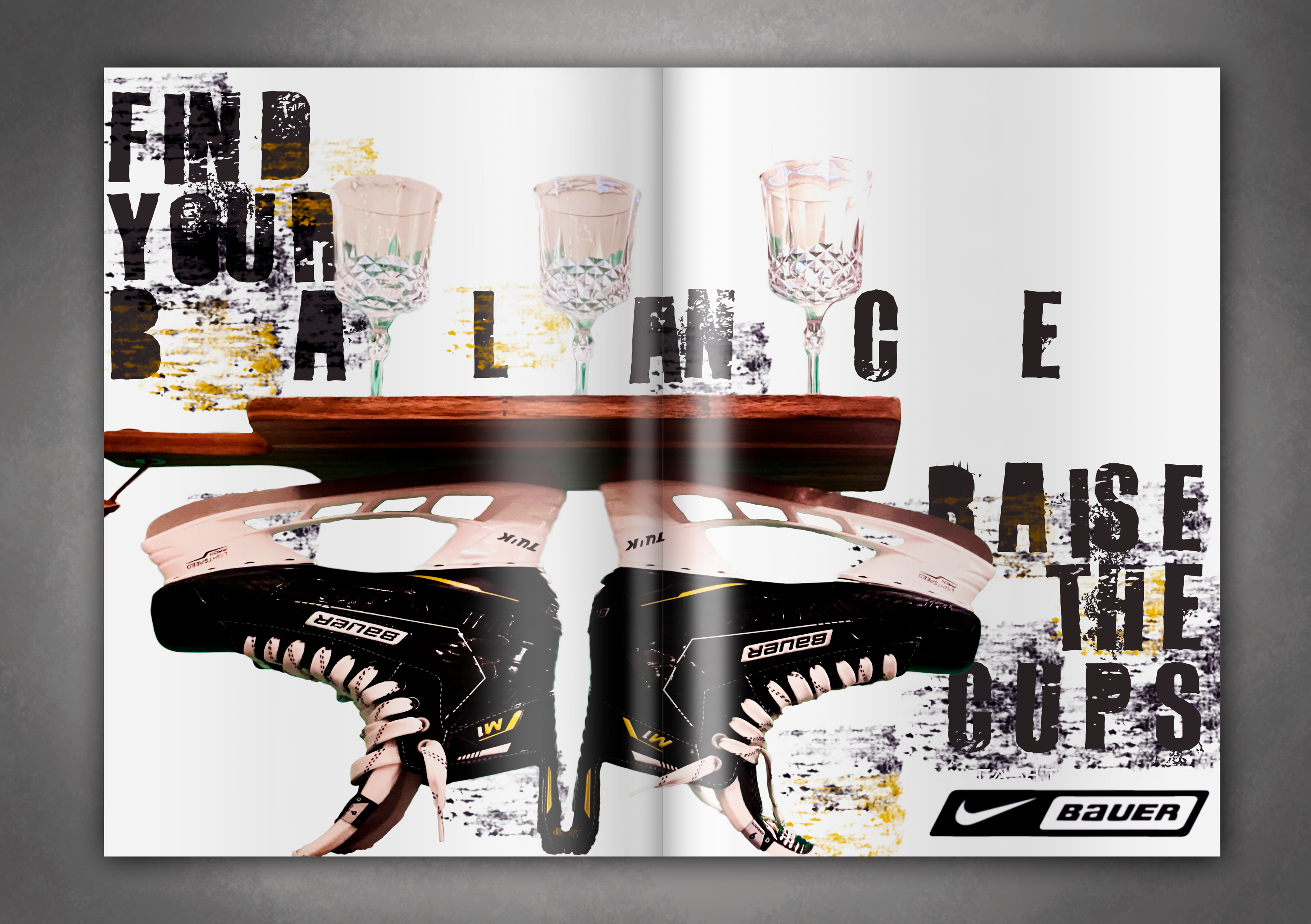
This art directed photo uses a loose kerning on "balance" that draws the eye to linger over the word, highlighting the centrality of balance in this message. The imagery of the skates balancing the cups directly in between the letters of the word adds even more depth, strengthening the big idea of the advertisement.
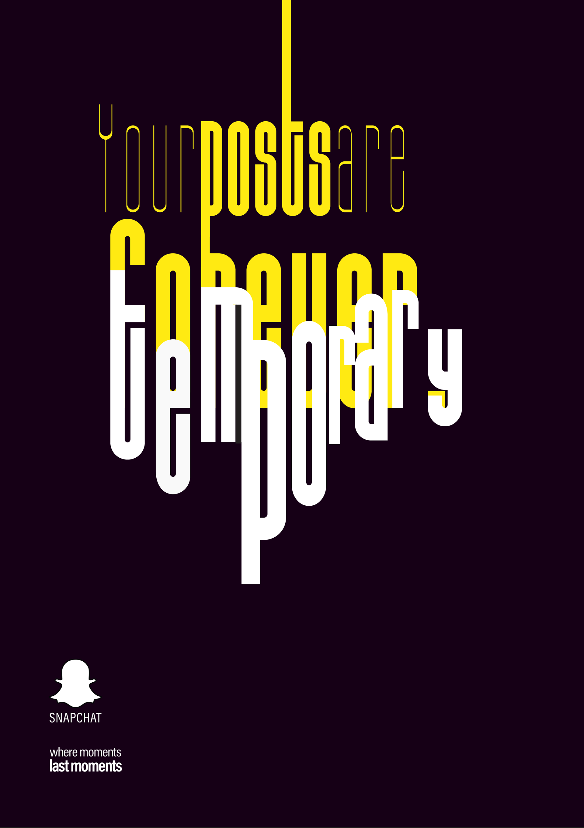
This exercise effectively combined techniques like overlapping text, text floating in space, and the theory of relatively III to convey the fragility of the consumer's posts on Snapchat, which is automatically put to contrast against the common phrase "Your posts are online forever."